Industry
Jewelry & Encouragement
Client
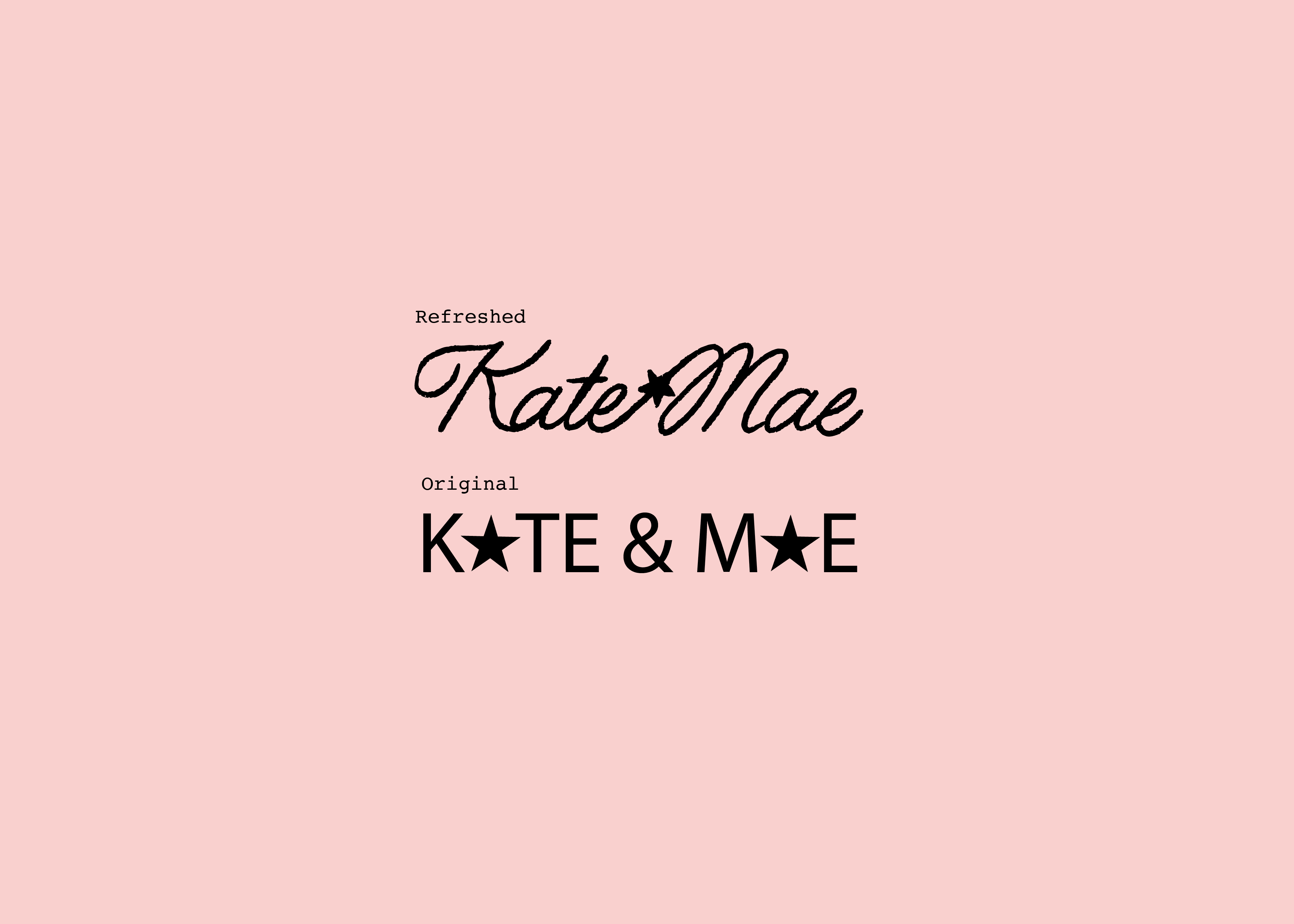
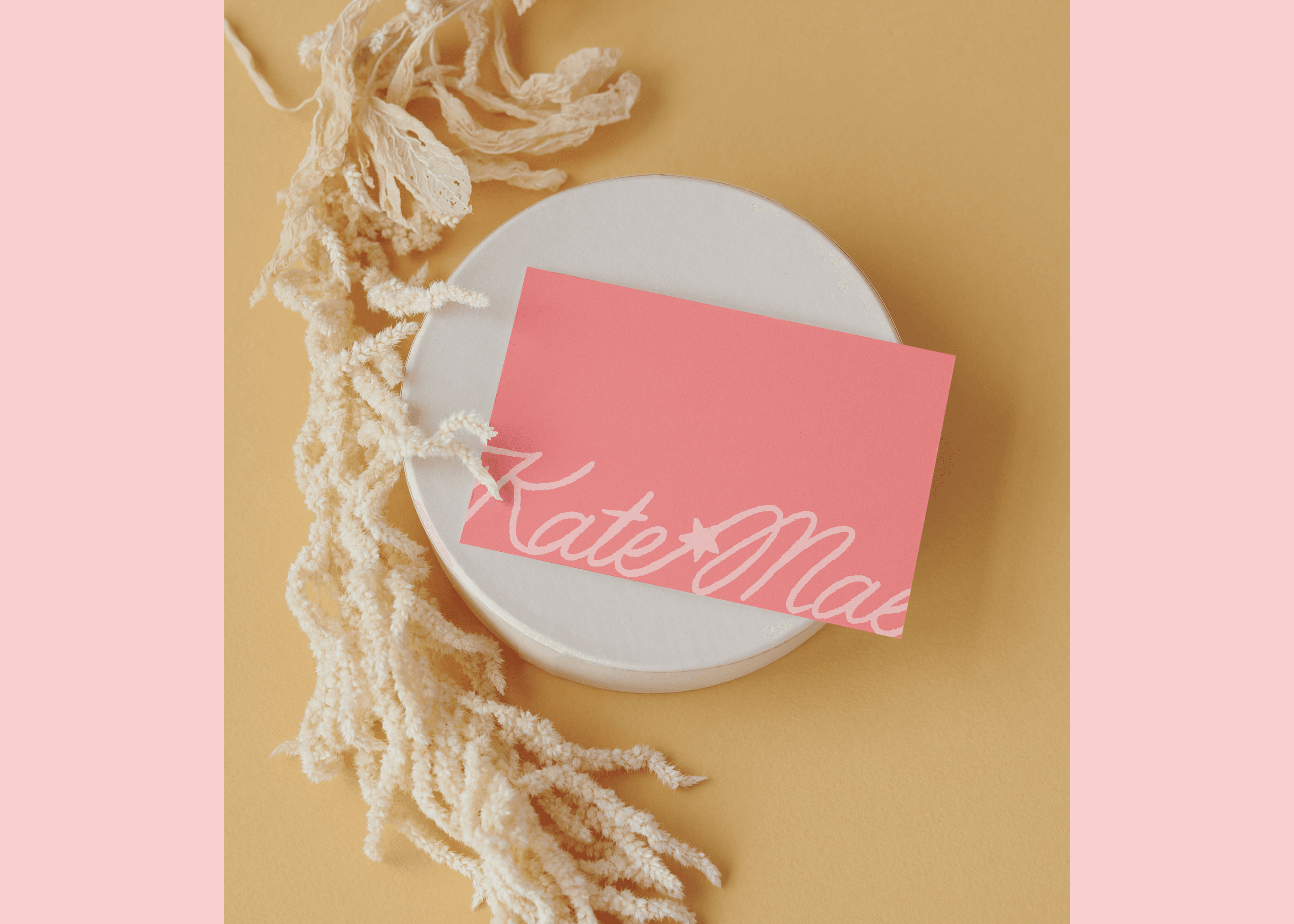
Kate & Mae
Developing the Visual Identity and Brand Experience of a Young Company into One Defined by Trust, Elegance, and Credibility
Our team partnered with the client to evolve its visual identity into a more mature, trusted, and sophisticated brand while preserving its elegance and distinct character.
Problem. As Kate & Mae Jewelry continued to grow, its visual identity no longer reflected the quality, craftsmanship, and trust associated with the brand. While the existing aesthetic felt approachable and elegant, it lacked the maturity and refinement needed to position the company as an established jewelry brand. Concept. Our team developed a brand evolution strategy focused on elevating the visual experience while preserving the qualities customers already valued. By refining the brand's design language, typography, color palette, and overall presentation, we sought to create a more sophisticated and credible identity that felt timeless rather than trendy. Solution. The refreshed brand introduces a cleaner, more refined aesthetic that communicates confidence, craftsmanship, and trust. Through thoughtful adjustments to the visual system, Kate & Mae Jewelry now presents itself as a more established and elegant brand while maintaining the warmth and authenticity that define its customer experience.